Bybanen should be easy to spot in the cityscape. The orange information point makes the stop visible, while the ‘white line’, the track, and the tram poles indicate where Bybanen runs. The lighting and the tactile guidelines at the stop make it easy for travellers to find their way.
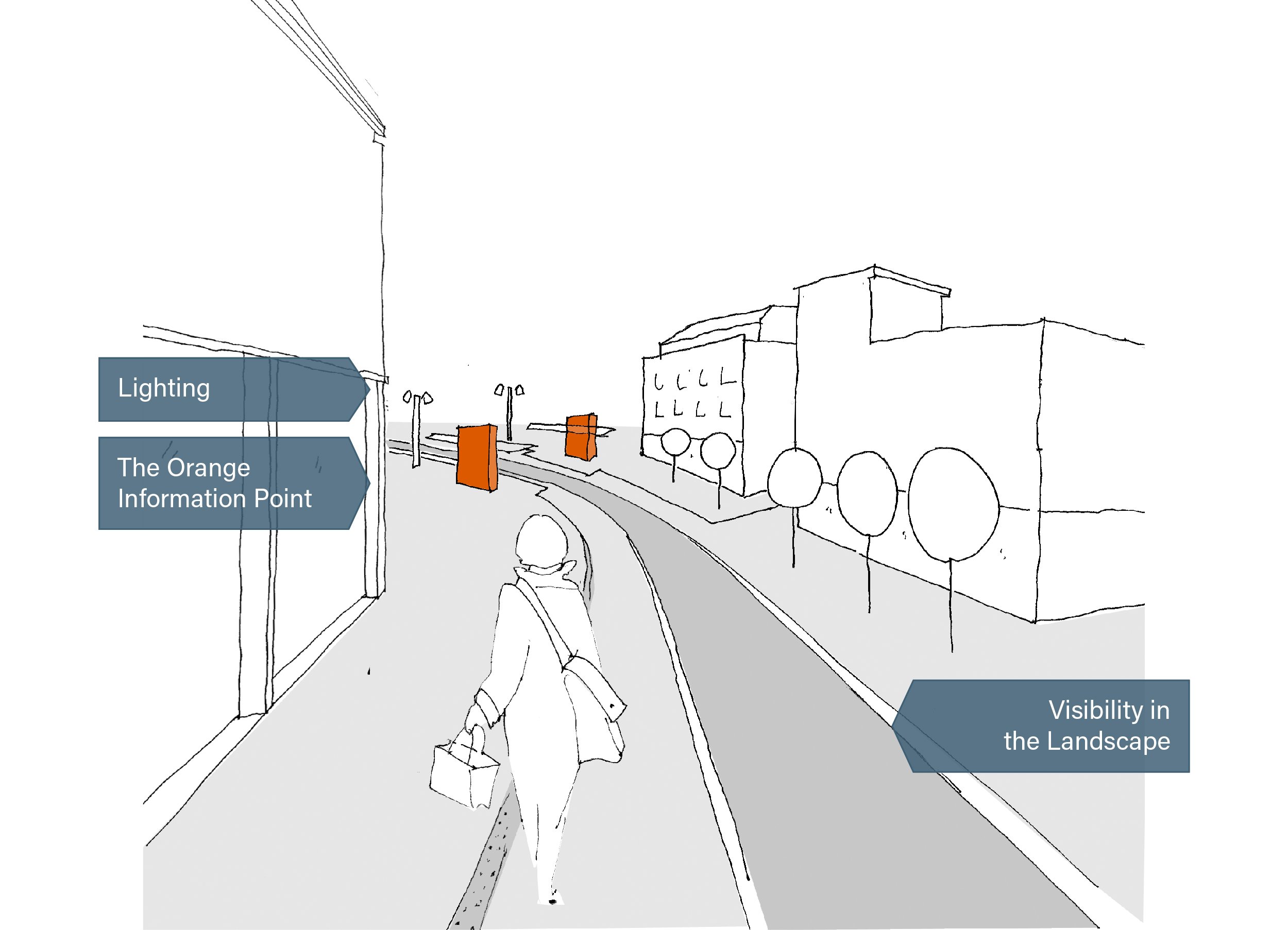
The Orange Information Point
The orange information point is Bybanen’s ‘beacon’, showing the way to the stop. It’s visible from a distance, is identical at every stop, and makes it easy to locate the stop.

The orange information point is highly visible in the dense city as well as the open landscape. Its colour and height make it visible from a large distance. It shows you where to buy your ticket at the stop. It is the stop’s information point where all information is gathered.
The Colour Is Inspired by Bergen
The orange information point takes its colour from the buildings in Bergen. Its design is distinctly minimalistic, blending in with the city as a whole as well as giving Bybanen its own character.


Visibility in the Landscape
Bybanen’s line, the ‘white line’, the track, tram poles, and tactile guidelines all contribute to showing the way to the Bybanen stops in a unified, universal design.

The tactile guidelines show the way to the stop, where the tram stops, and where the doors open.
The ‘white line’ and the track show where the tram runs through the city. The track and the tram poles enhance Bybanen’s visibility. The use of different materials in the track informs other road users about crossings and create a connection to the landscape surrounding the tram.


Lighting
The lighting at the platform makes it easier for the travellers to find their way in the dark. The lighting makes the stop visible in its surroundings and provides overview and safety to the traveller.

Two levels of platform lighting have been developed, and together these provide overview and safety. The tram poles shine a bright light over the entire stop area, while the interior lighting in the shelters provide a warm and embracing light.
A Safe Atmosphere
To create a safer and more inviting atmosphere, the lighting in the superstructure and at the orange information point is stronger than on the rest of the platform.


Main photo: Francisco Munoz, Morten Wanvik, Ivan Brodey, Atle Kårstad
Illustrations: Arkitektgruppen Cubus